
How to Build Predictive Analytics in Excel for FP&A (No coding experience required)
Simplify your forecasting with Excel, Copilot, and three easy models

Every time I sit down with a new client, they want to know how to start building predictive analytics.
Now, it used to be that you would need a ton of infrastructure to get up and running with AI and advanced predicted algorithms. I have sat on both sides of the client / vendor table and heard about all of the heavy IT lifting, and long lead time and capital investment that would need to happen to forecast sales.
I’m going to show you how to do it with an Excel spreadsheet and a little help from Copilot.
Want to see this in action? Check out a YouTube playlist that covers this end-to-end:
Setting the Table
We’re going to use data from Maven analytics that comes from a hypothetical company called “Northwind Traders.” Our task is simple: our current sales receipts forecast process sucks, and we need to fix it.
Their current approach of using simple moving averages to project sales receipts has created problems in their cashflow forecasting process. Their data lacks consistency, and the moving average method proves too inaccurate for their forecasting needs.
For simplicity's sake, I dumped the prepared data into a clean and tidy Excel table, but I'll probably do another installment around how to prep your data using Power Query.
Feature Engineering
The next part will consume 80% of your time and effort. In the world of data science, we call it feature engineering. In the finance world, I call it “picking the best inputs that will predict the best outputs.”
In a real-world scenario, we’d want to find the right mix of internal and external data inputs (x-variables) that are a) highly correlated with the output we are trying to predict (y-variable) and b) collectively explain as much of the variability in our output as possible (measured by r-squared).
The beauty of accomplishing this means that we have what all FP&A professionals crave - easily articulated variance drivers.
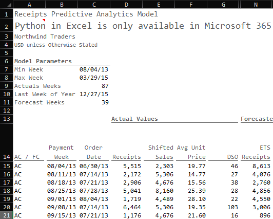
To do this in Excel, we simply start pulling data for the available variables:
Payment Date: the unique payment dates available in our data sorted from oldest to newest using a SORT(UNIQUE(FILTER))) formula
Order Date: the date when the order was placed based on the payment date using a conditional XLOOKUP formula
Receipts: the cash receipts from based on the payment date using a SUMIFS formula; this is the y-variable we are trying to predict
Shifted Sales: the net sales of the cash receipts based on the order date using a SUMIFS formula
Avg Discount: the aggregate average percent that was applied on gross sales for a given order date using an AVERAGEIFS formula
Avg Unit Price: the aggregate average price that was charged for a given date using an AVERAGEIFS formula
Days of Sales Outstanding (DSO): the total number of days it took the customer to pay (Payment Date less Order Date) using a SUMIFS formula
Using the correl() function in Excel, we can easily determine the relationship between the inputs (Shifted Sales, Avg Unit Price, Days of Sales Outstanding) and the output (Receipts):
Shifted Sales: 0.556
Avg Unit Price: 0.532
DSO: 0.512
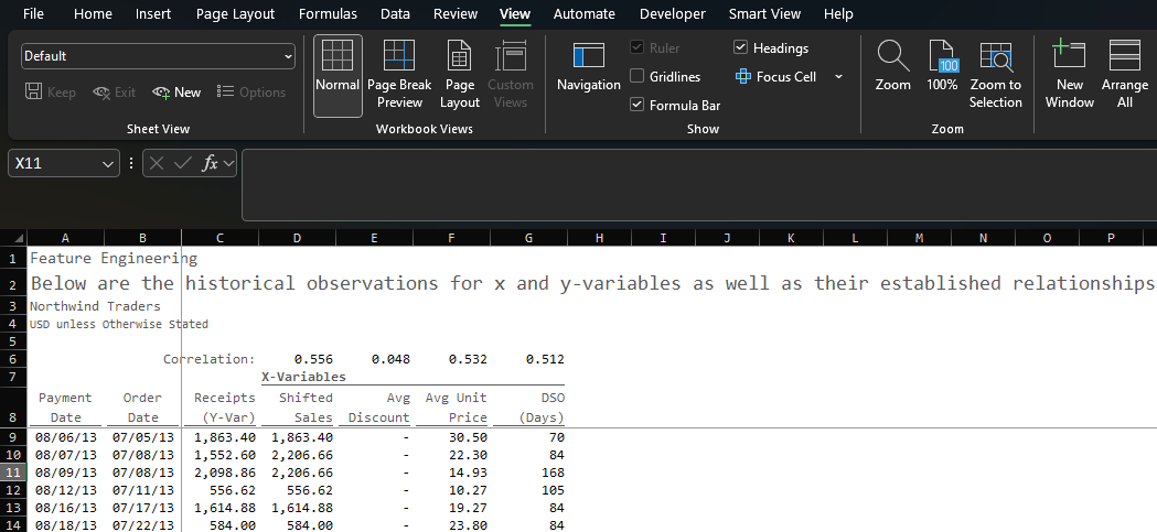
Now, these correlations are relatively weak. We would rather see factors closer to 1 or -1. To dive a bit deeper, if we square each of these figures, we can determine how much of the variation in Receipts is explained by each independent variable (31%, 28%, and 26% respectively).
Clearly I wouldn’t stake my job on the strength of these relationships, but they’re strong enough to demonstrate how to do this in practice. In a real-world scenario, we would want stronger relationships and we’d even be pulling external data points (inflation, market growth, weather patterns, etc.), but this is made-up data and I have shit to do so these are good enough.
Setting up the Model(s)
A quick note about granularity
Now it’s time to bring our data together in a summarized way. It’s important when it comes to these models, the less dimensions the better. In this case, our only dimension payment week.
This can be frustrating if you want to forecast by category, but if you go that route you’d ideally want to treat each category as a forecast point. It’s also important for you to ask “Why do we need to forecast at a more granular level if it does not yield better results?” More often than not, the answer is some form of “well, we always forecast by product category.” I don’t have a ton of patience for the “it’s the way we’ve always done it” explanation.
That said, if you’re a sales analyst supporting a particular product category or you need to plan commissions for sales personnel, that’s a completely different story. Maybe instead of forecasting every category, you only forecast the most important categories.
In the world of finance, we love the details. It’s critical that you parse out when the details are important and when they are not. Plus, just because a forecast is performed at a higher level doesn’t mean that the forecast is not detailed or less informative.
Setting up the time horizon
We start by setting up model parameters based on our imported data:
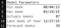
We find the minimum week in the data set (C7): =MIN(orders_training[paymentWeek])
We find the maximum week in the data set (C8): =MAX(orders_training[paymentWeek])
We find the number of actual weeks (C9): =((C8+7)-C7)/7
We determine the Last week of the year (C10): =EOMONTH(DATE(2015,12,1),0)-(WEEKDAY(EOMONTH(DATE(2015,12,1),0))-1)
you could also simply input the last week of the year, but I’m all about the automation
We determine the number for weeks in the forecast (C11): =ROUND((C10-C8)/7,0)
This gives us a total of 126 weeks (87 weeks of actuals and 39 weeks to forecast). Typically, you shouldn’t get too far over your skis with how many forward-looking periods you are trying to forecast because the further you go into the future the more unreliable the results (the world tends to change after all).
So again, in practice, we would either limit the number of weeks we’d forecast or we’d keep what we have but only publish a shorter-term forecast (e.g. 13 weeks).
Generate the Dates
With these model parameters, I can establish our time horizon and determine whether those dates are actual (AC) dates or forecast (FC) dates.
AC / FC: If the payment week is less than or equal to the Payment week, then it’s an actual date (AC) otherwise it’s a forecasted date (FC)
Payment Week: We generate a sequence of weeks based on the minimum week in the data set and the total number of weeks defined by the model parameters
Order Date: For actual payment dates, we can establish the week in which the original order took place
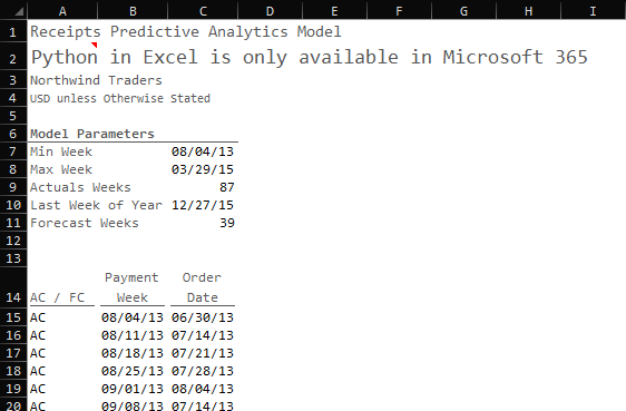
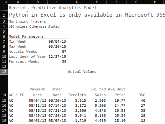
With our time horizon set, we can bring in the actual data points from our data set.
Time to Predict
To make our predictions we are going to use two different models:
Exponential Trend Smoothing
Multiple Linear Regression
Autoregressive Integrated Moving Average with Exogenous Inputs (ARIMAX)
Why do we use three different models? For one, not all models are created equal, they all have pros can cons, so it’s better to be armed with multiple that are targeted at the same variable you’re trying to predict.
Secondly, averaging predictions from multiple models often leads to better performance than any single one.
In general, I aim to build out 3-5 predictive models (sometimes more) when I’m trying to forecast a given data point. The beauty of python is that it is fully open-source so if you want to integrate a new model, you can build it directly into excel and you can use Copilot to help you with model selection and implementation.
So, the goal here is to make three stabs at the same prediction and then measure each one’s performance along with the ensemble (average) prediction.
Exponential Trend Smoothing
This one is easy and it comes right out of the box. Exponential Trend Smoothing (ETS) algorithms are really useful when you have a bunch of historical data points of the variable you’re trying to predict and it follows are relatively stable historical pattern.
This will also come in handy when we go to craft forward-looking independent variables.
Here’s the formula: =FORECAST.ETS(Target_Date, Values, Timeline, Seasonality, Data_Completion)
=FORECAST.ETS($B$15#,FILTER(D$15#,$A$15#="AC"),FILTER($B$15#,$A$15#="AC"),1,1)
Target_Date is the date you’re trying to forecast (we’ll do this for both historical periods and future periods)
Values are the historical values for the variable we are trying to predict (in this case receipts)
Timeline is the list of dates that those actual historical values correspond with
Seasonality is optional and I mostly use the default which tells the algorithm to automatically detect seasonality patterns
Data_Completion is also optional but I always use 1 which tells the algorithm to fill in missing values
In our excel file, here is what is looks like:
Multiple Linear Regression with NumPy
Before we build the prediction using linear regression, we need to create forecasted values for our independent variables. To do this, we simply repeat the ETS function we did above for each of the independent variables (Shifted_Sales, Avg_Unit_Price, and DSO):
Now we need to get into Python. To initiate python, click where you want the values to start and enter =py into the cell / formula. This will initialize an environment for python that will allow you build scripts directly into cells.
If you aren’t comfortable with python, don’t worry copilot is unbelievable at acting as a coder. I have learned more in the last year with AI helping me build code than I did in the previous four when I started to learn the language.
I wrote a separate post on exactly how I came up with this final algorithm but here is the cliff notes version. That’s right, Copilot wrote the script you see below, and I was using it in five mins.
import pandas as pd
import numpy as np

# Load dynamic data
data_dict = {
    "AC_FC": xl("A15#", headers=False).iloc[:, 0],       # AC/FC (single column)
    "Order_Date": xl("B15#", headers = False).iloc[:, 0],  # Dates
    "Shifted_Sales": xl("E15#", headers=False).iloc[:, 0], # Historical Gross_Sales
    "Avg_Price": xl("F15#", headers=False).iloc[:, 0],   # Historical Net_Sales
    "DSO": xl("G15#", headers=False).iloc[:, 0],         # Historical DSO
    "Receipts": xl("D15#", headers=False).iloc[:, 0],    # Historical Receipts
    "Shifted_Sales_Forecast": xl("H15#", headers=False).iloc[:, 0],  # Forecasted Gross_Sales
    "Avg_Price_Forecast": xl("I15#", headers=False).iloc[:, 0],    # Forecasted Net_Sales
    "DSO_Forecast": xl("J15#", headers=False).iloc[:, 0]           # Forecasted DSO
}

# Create DataFrame
data = pd.DataFrame(data_dict)

# Convert Order_Date to datetime and calculate Days_Since
data["Order_Date"] = pd.to_datetime(data["Order_Date"], errors='coerce')

# Split into historical (Actual) and future (Forecast) data
historical_data = data[data["AC_FC"] == "AC"].copy()
future_data = data[data["AC_FC"] == "FC"].copy()

# Train the model on historical actuals
X_train = historical_data[["Shifted_Sales", "Avg_Price", "DSO"]]
Y_train = historical_data["Receipts"]
X_train_with_intercept = np.c_[X_train, np.ones(X_train.shape[0])]
coefficients, _, _, _ = np.linalg.lstsq(X_train_with_intercept, Y_train, rcond=None)

# Prepare X variables for all periods
# Use actual X for AC periods, forecasted X for FC periods
data["X_Shifted_Sales"] = np.where(data["AC_FC"] == "AC", data["Shifted_Sales"], data["Shifted_Sales_Forecast"])
data["X_Avg_Price"] = np.where(data["AC_FC"] == "AC", data["Avg_Price"], data["Avg_Price_Forecast"])
data["X_DSO"] = np.where(data["AC_FC"] == "AC", data["DSO"], data["DSO_Forecast"])

# Predict Receipts for all periods
X_all = data[["X_Shifted_Sales", "X_Avg_Price", "X_DSO"]]
X_all_with_intercept = np.c_[X_all, np.ones(X_all.shape[0])]
data["Linear_Receipts"] = X_all_with_intercept.dot(coefficients)

# Output results without index
data["Linear_Receipts"].values
What does this do? The script produces an output called data[“Linear_Receipts”].values. This output is the series of predictions for receipts from the first date in the dataset (8/4/13) through the last date (3/29/15).
This ouput is the result of a linear regression algorithm that uses Shifted_Sales, Avg_Price, and DSO to predict receipts. For historical periods, we are using actual values for these data points. For forecast periods, we are using forecasted values for these data points.
Autoregressive Integrated Moving Average with Exogenous Inputs (ARIMAX)
Autoregressive Integrated Moving Average (ARIMA) isn’t all that much different than ETS. In both scenarios, we are fitting historical receipts to a trend line and then extrapolating that trend over a period of time into the future. The nuance is simply in how the mathematical models function underneath the hood.
We are going to take ARIMA a step farther by also including “Exogenous Inputs” which influence the trend of receipts. We’ve already established a relationship between Receipts and Shifted Sales, Avg Unit Price, and DSO.
This helps to better inform the trend of Receipts that we are attempting to forecast.
With this data set, each produced results that were in the same ballpark.
Here is the script we punch into excel:
import pandas as pd
import numpy as np
from statsmodels.tsa.arima.model import ARIMA

# Load dynamic data
data_dict = {
    "AC_FC": xl("A15#", headers=False).iloc[:, 0],       # AC/FC
    "Order_Date": xl("B15#", headers=False).iloc[:, 0],  # Dates
    "Receipts": xl("D15#", headers=False).iloc[:, 0],    # Historical Receipts
    "Shifted_Sales": xl("E15#", headers=False).iloc[:, 0], # Historical Shifted_Sales
    "Avg_Price": xl("F15#", headers=False).iloc[:, 0],    # Historical Avg_Price
    "DSO": xl("G15#", headers=False).iloc[:, 0],          # Historical DSO
    "Shifted_Sales_Forecast": xl("H15#", headers=False).iloc[:, 0],  # Forecasted Shifted_Sales
    "Avg_Price_Forecast": xl("I15#", headers=False).iloc[:, 0],      # Forecasted Avg_Price
    "DSO_Forecast": xl("J15#", headers=False).iloc[:, 0]             # Forecasted DSO
}

# Create DataFrame
data = pd.DataFrame(data_dict)

# Convert Order_Date to datetime and set as index
data["Order_Date"] = pd.to_datetime(data["Order_Date"], errors='coerce')
data = data.set_index("Order_Date")

# Split into historical (Actual) and future (Forecast) data
historical_data = data[data["AC_FC"] == "AC"].copy()
future_data = data[data["AC_FC"] == "FC"].copy()

# Prepare historical Receipts and exogenous variables for ARIMAX
receipts_series = historical_data["Receipts"].asfreq("W-SUN", method="ffill").dropna()
exog_train = historical_data[["Shifted_Sales", "Avg_Price", "DSO"]].reindex(receipts_series.index).dropna()

# Ensure receipts_series aligns with exog_train after dropna
receipts_series = receipts_series.loc[exog_train.index]

# Fit ARIMAX model (order=(1,1,1) as a starting point) with exogenous variables
model = ARIMA(receipts_series, order=(1, 1, 1), exog=exog_train)
model_fit = model.fit()

# Predict in-sample Receipts for AC periods
ac_predictions = model_fit.predict(start=receipts_series.index[0],
                                  end=receipts_series.index[-1],
                                  exog=exog_train)

# Forecast out-of-sample Receipts for FC periods
n_forecast = len(future_data)
exog_future = future_data[["Shifted_Sales_Forecast", "Avg_Price_Forecast", "DSO_Forecast"]]
fc_forecast = model_fit.forecast(steps=n_forecast, exog=exog_future)

# Assign predictions to the original DataFrame
data.loc[historical_data.index, "ARIMA_Receipts"] = ac_predictions.reindex(historical_data.index)
data.loc[future_data.index, "ARIMA_Receipts"] = fc_forecast

# Output ARIMA_Receipts for all periods without index
data["ARIMA_Receipts"].values
The script is taking the actual Receipts values, fitting those values to a trend, and then applying that trend into the future.
Judging the Outcomes
Now it’s time to evalulate how accurate our models are. Granted, no model is going to be 100% accurate, but we’d obviously prefer outcomes with a lower rate of forecast error.
I mentioned at the top that I’m using features that are weaker predictors than we would prefer simply for demonstration purposes, but now we get to see why that makes a difference.
Here are the forecasted values that each model produced:
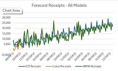
If we average the three models together we can compare the ensemble results to actual receipt values:
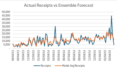
Honestly that’s not a horrendous picture, and it gets even better when we remove outliers from the actual results:
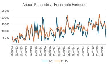
Here are how each of the models shook out:
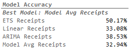
Notice that the avg of all three models had a lowest error rate of all. This demonstrates the value of using multiple models to do your forecasting. That said, 67.1% forecast accuracy isn’t necessarily something to write home about, but it’s a good start.
We could drastically improve the results by going back to the drawing board in regards to feature engineering. What independent variables might be better predictors? What other models would be use? How can we tweak those models to better fit our use case?
All questions that Copilot is more than capable to help us address.
What’s Next?
We’ve done something extremely powerful:
We’ve built a number of predictive analytics models
In doing so, we’ve built relationships between a key number of inputs and their impact on the output we are trying to predict
They way we’ve structured the data (using nothing but out-of-the-box excel functionality) makes the model fully automated and will run with updated data.
This opens the door for a new world of possibilities:
Automated rolling forecasting
Automated Variance analysis
OKRs based on the inputs
Ready-Made Scenario Analysis
We’ll get into each of these areas over the next several weeks!